This document outlines the core visual language to communicate Verso’s Book Club program. Throughout all media—publications, websites, advertising, signage, products, letterhead, or business cards—layout, color and typography should be orchestrated to impart and solidify a unified signature.
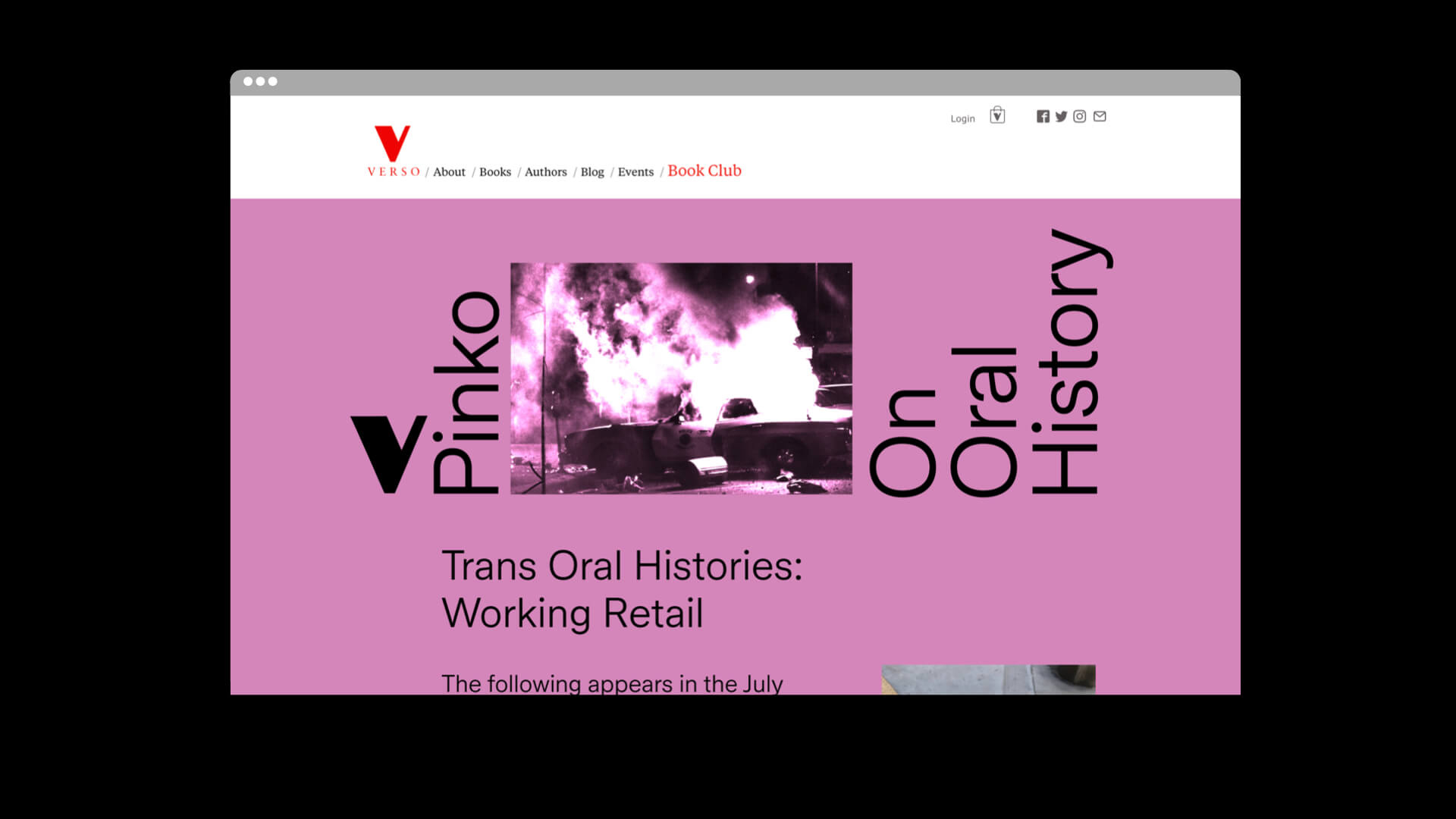
The Verso Book Club identity system is based on simple rules. It is colorful and straightforward. Keep this in mind when utilizing our brand assets. It’s main pillars are clashing color combinations and simple typogaphy. Images are typically treated with a duotone effect. And every once in a while, we employ rotated text for visual impact.
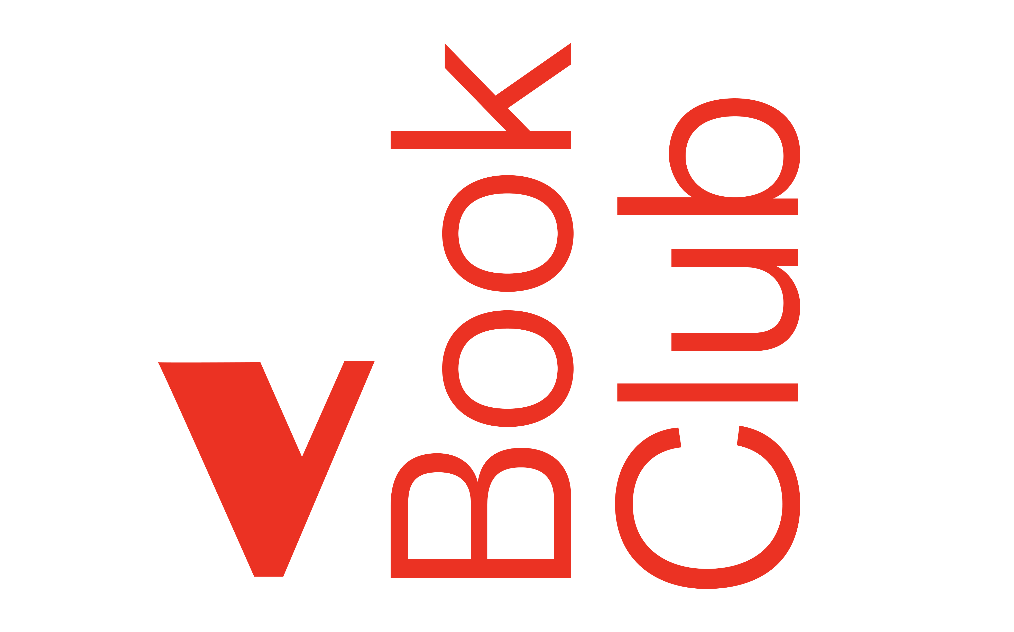
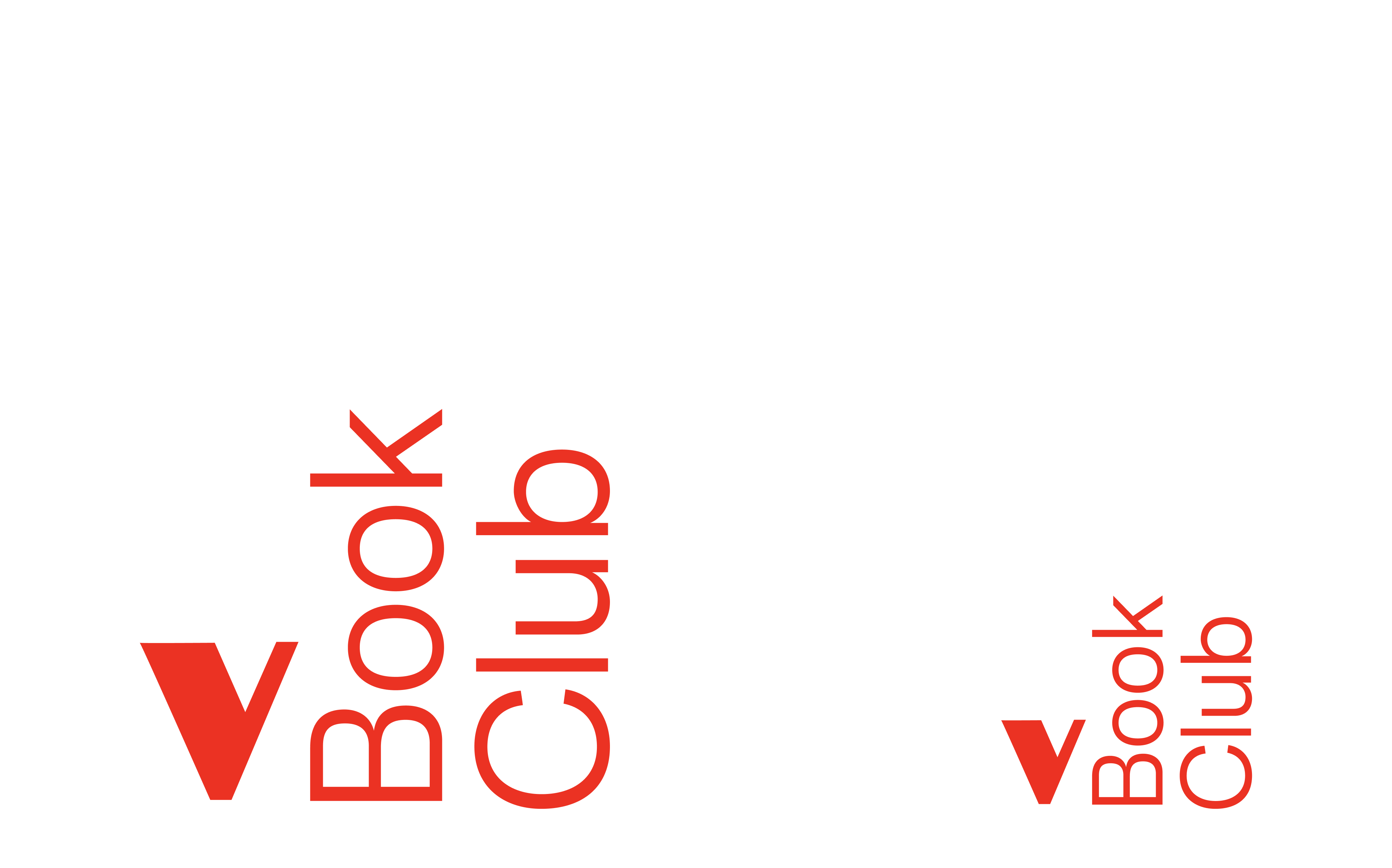
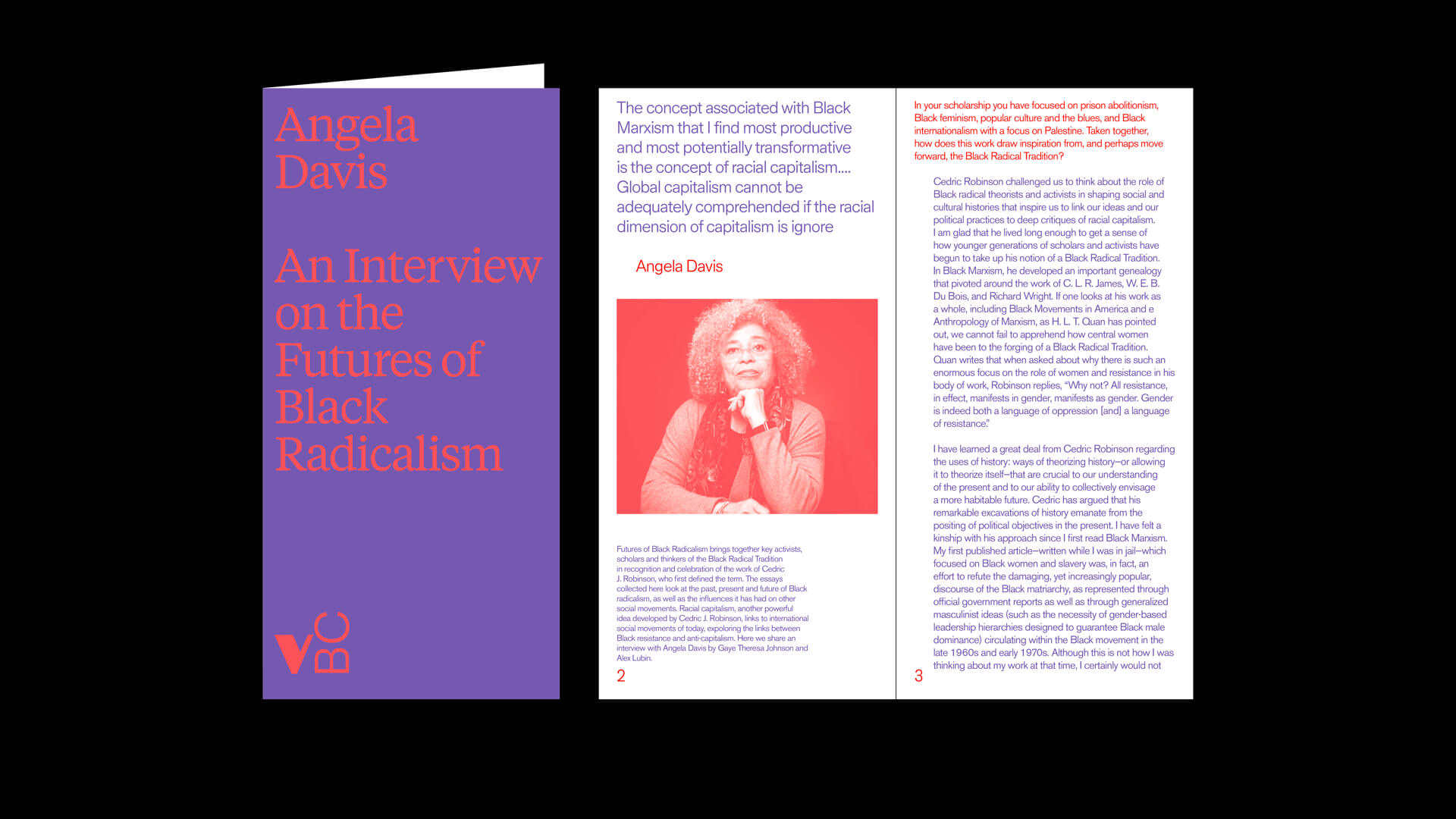
A wordmark or logotype is a distinct text-only typographic treatment of the name of a company. The VBC Wordmark locks up Verso’s iconic ‘V’ logo with rotated text, referencing spines of stacked books.
Download
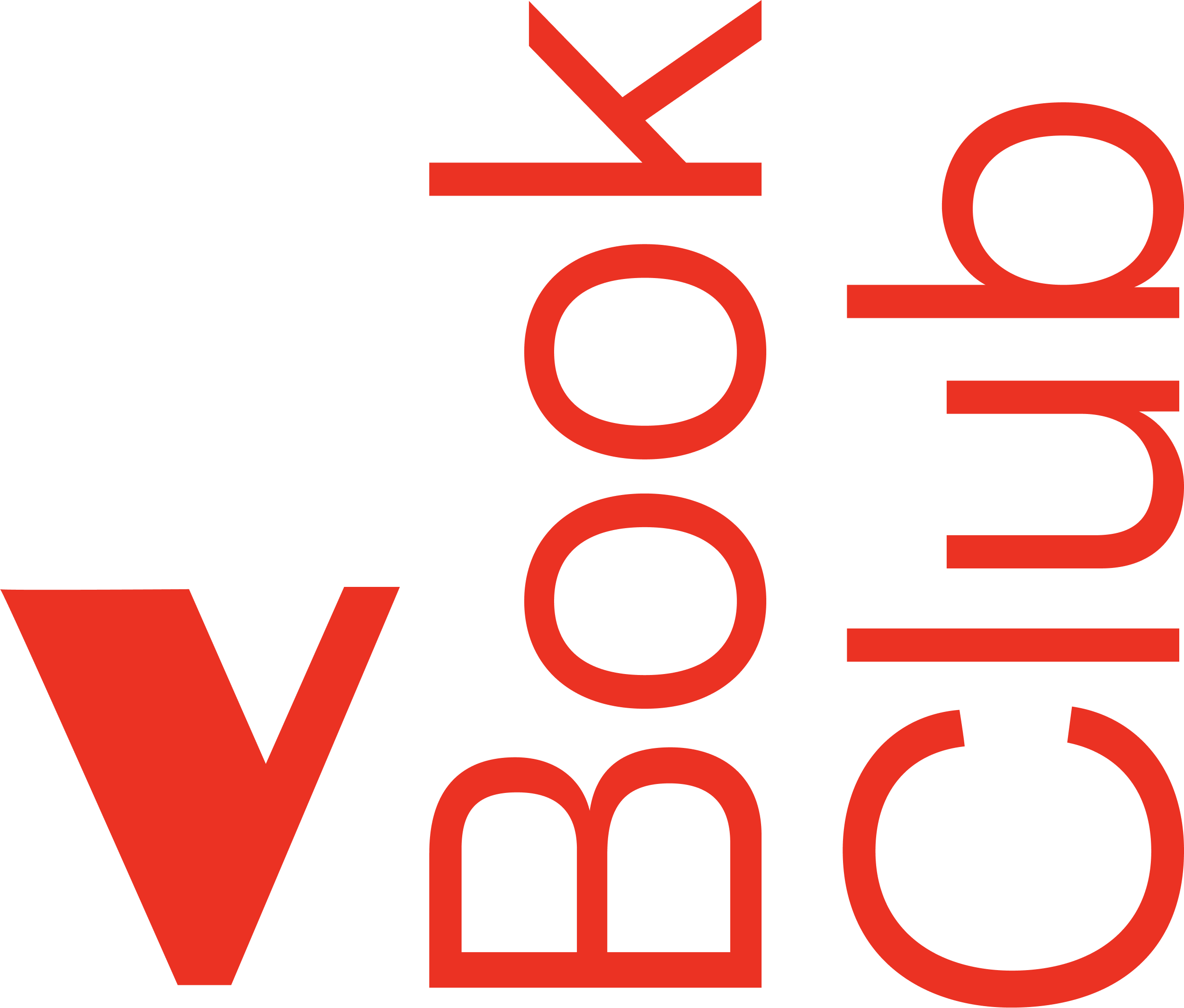
We can also use our wordmark lockup as a ‘framing device’. This provides an opportunity to place content between the wordmark elements. There is an animation style prepared to transition between multiple types of content, say for example a book cover and description.
Download
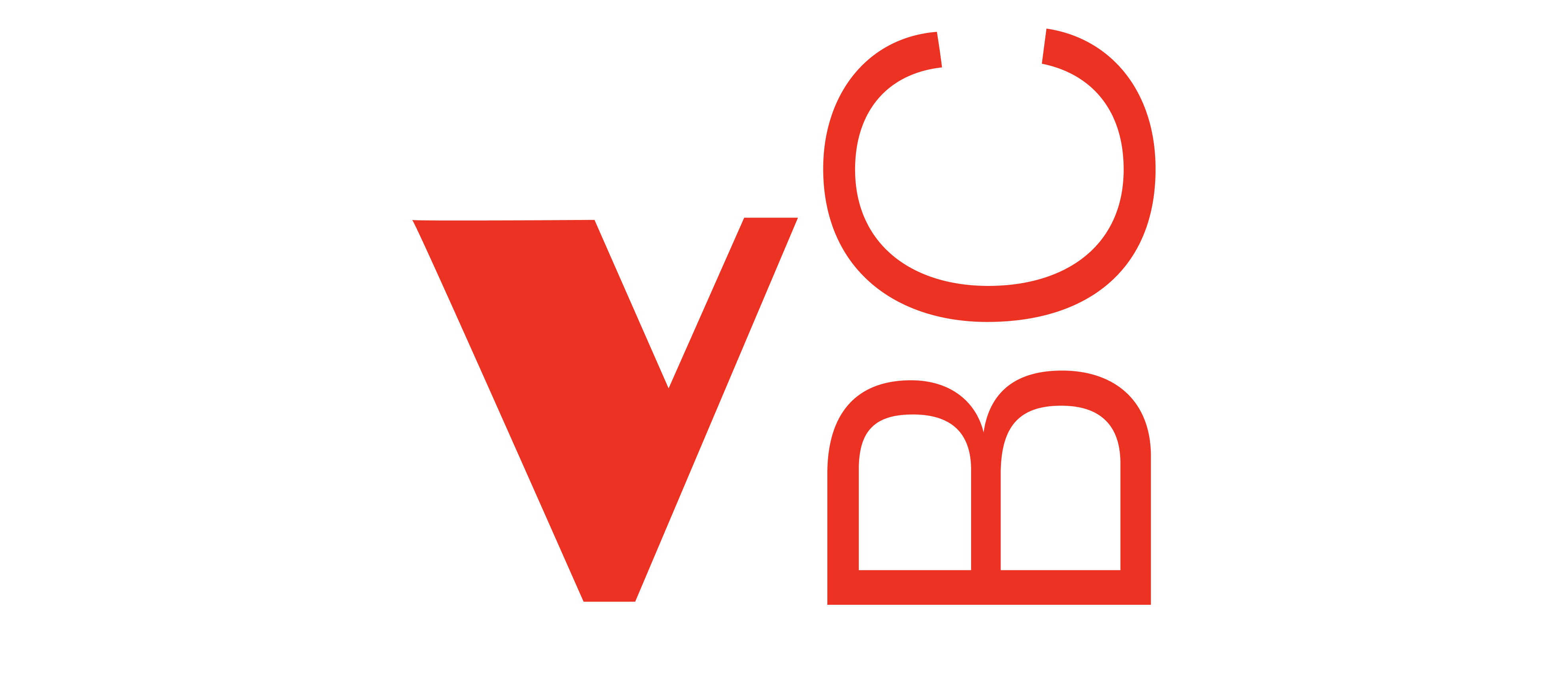
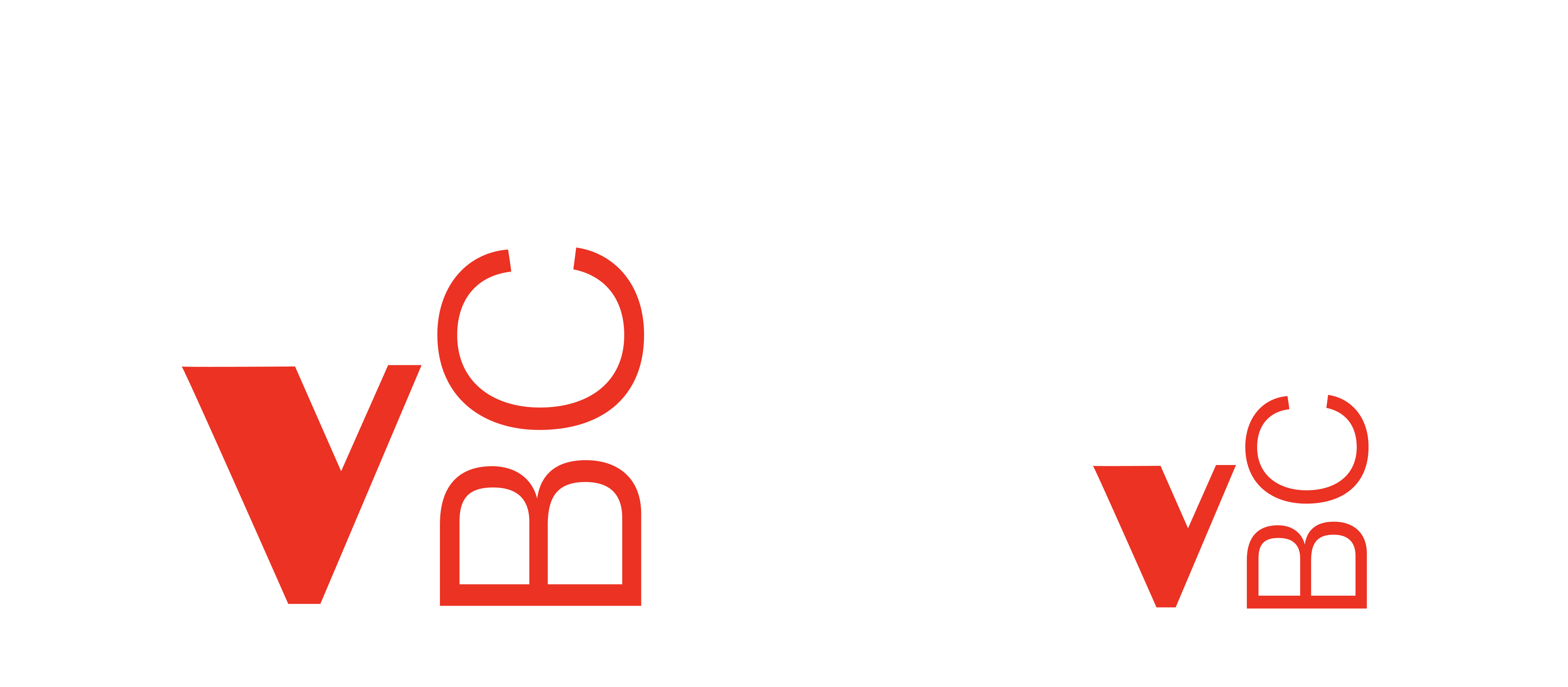
We also have an abbreviated version of the wordmark. This can be used for icons, avatars, sign-off’s and scenarios where size is a constraint.
Download
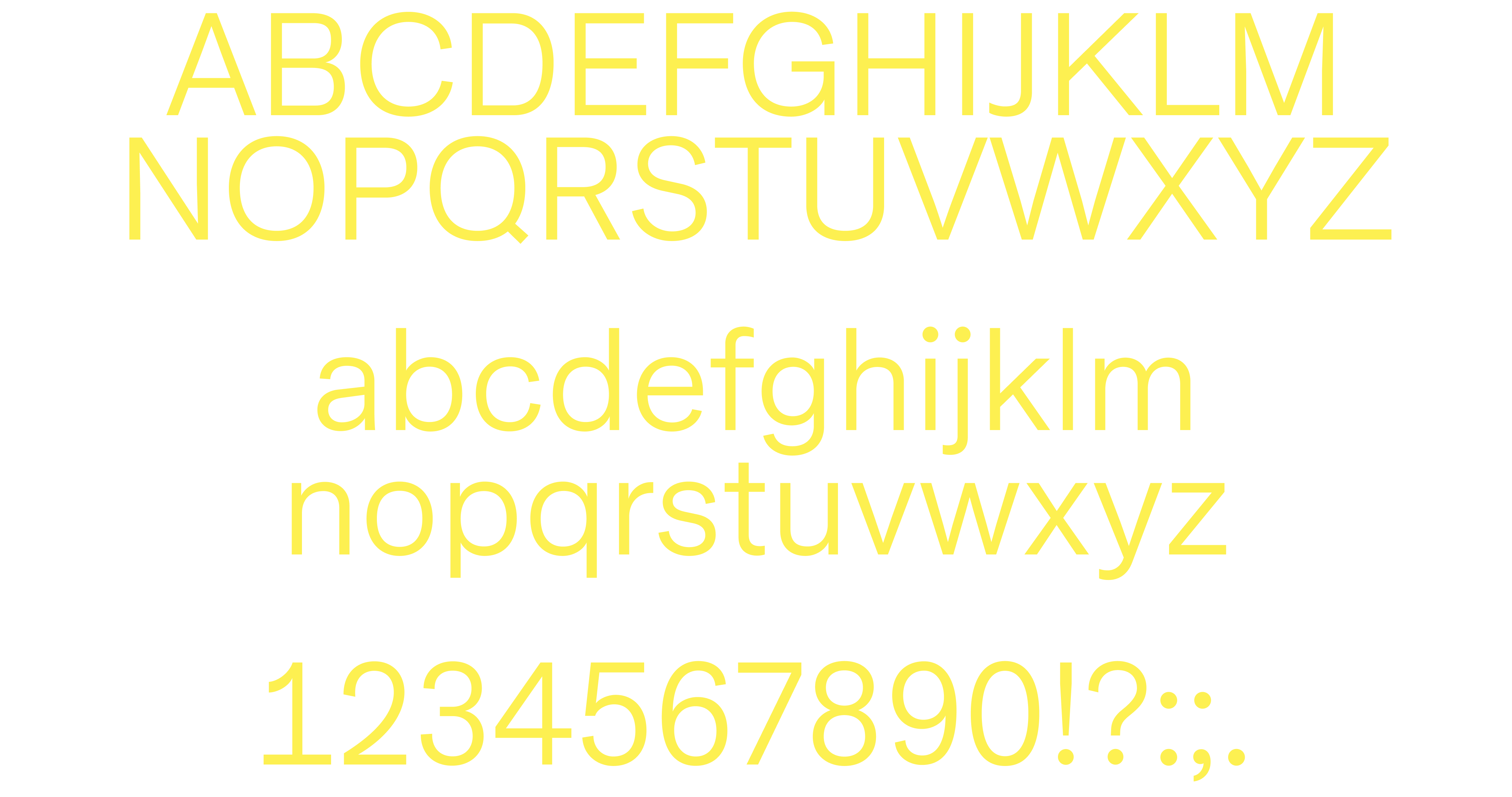
Our brand typeface is ‘ABC GGK’ by Dinamo. We use it for most applications, from headlines to body copy. ‘ABC GGK’ is a straight forward trace of GGK’s Berthold Standard rework for film-setting (1967), found in Josef Müller-Brockmann’s book Grid Systems.
Download
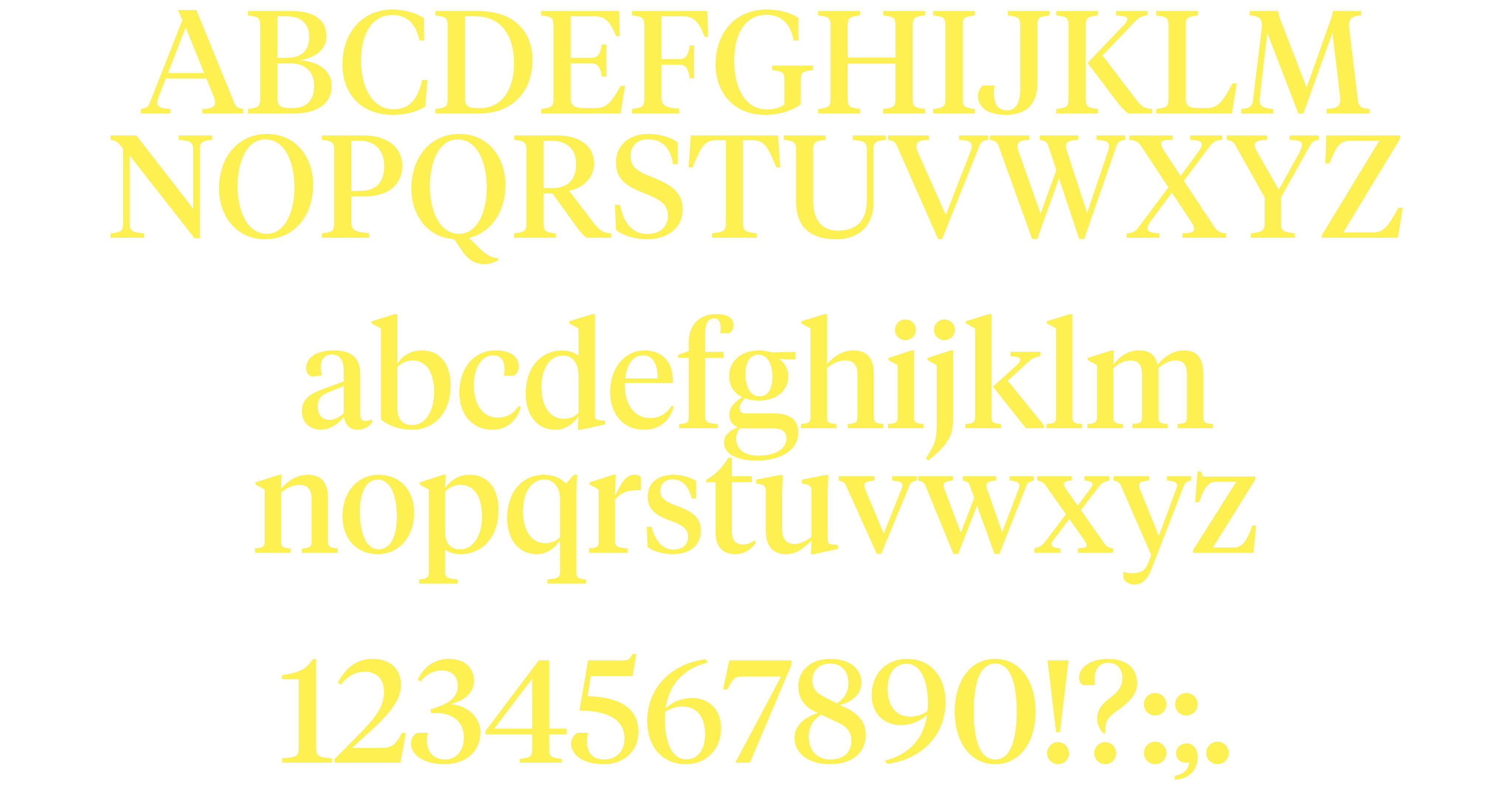
Our secondary typface is Tiempos, the brand typeface for Verso Books. We use tiempos for larger blocks of text, or when we need to add a more serious, literary feeling to a design or layout. When setting headlines and larger text, use Tiempos Headline.
Download
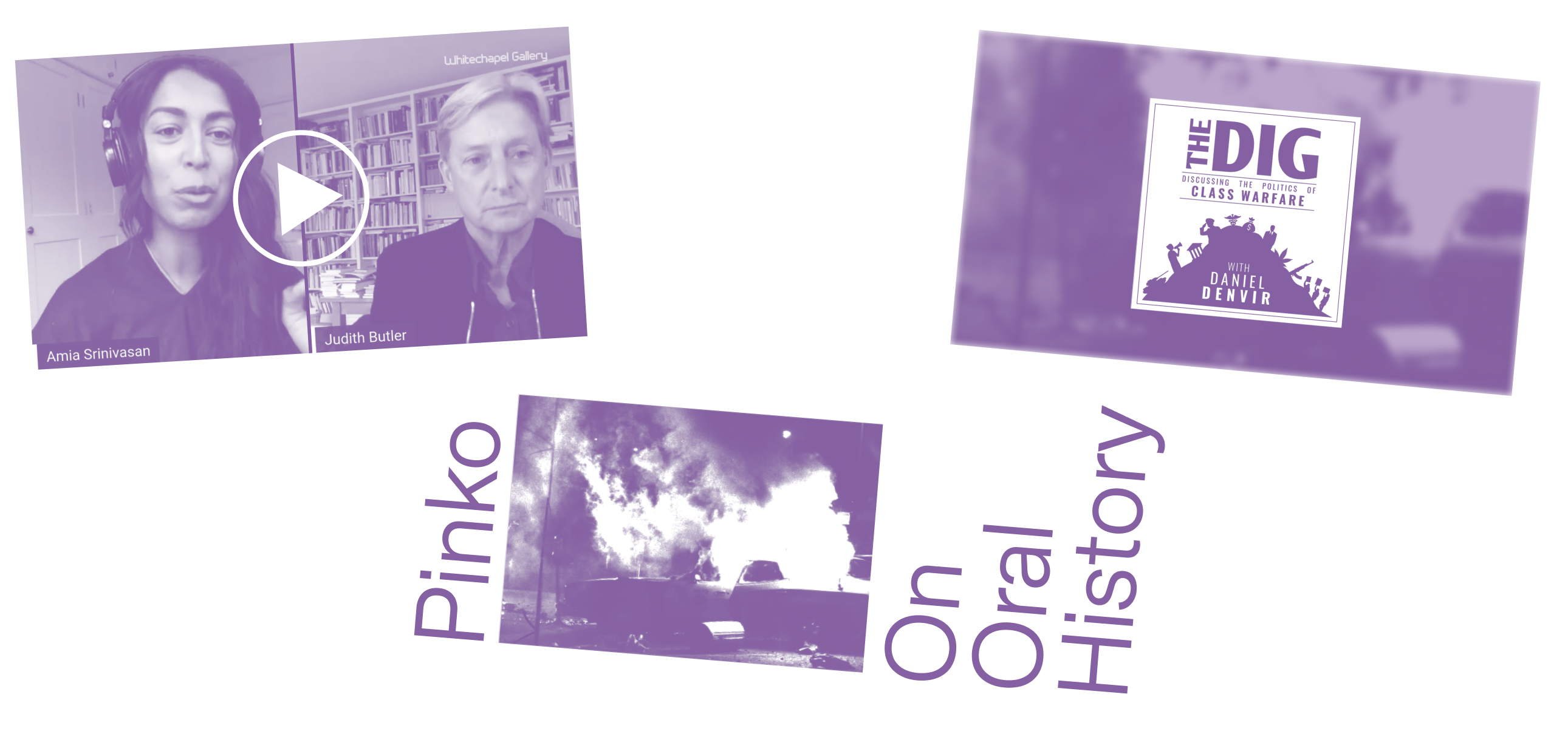
We style images with a duotone effect. This creates a uniform baseline for our design system. The color chosen should match the text color of your design. You can download an example Photoshop file with our duotone effect applied.
Download
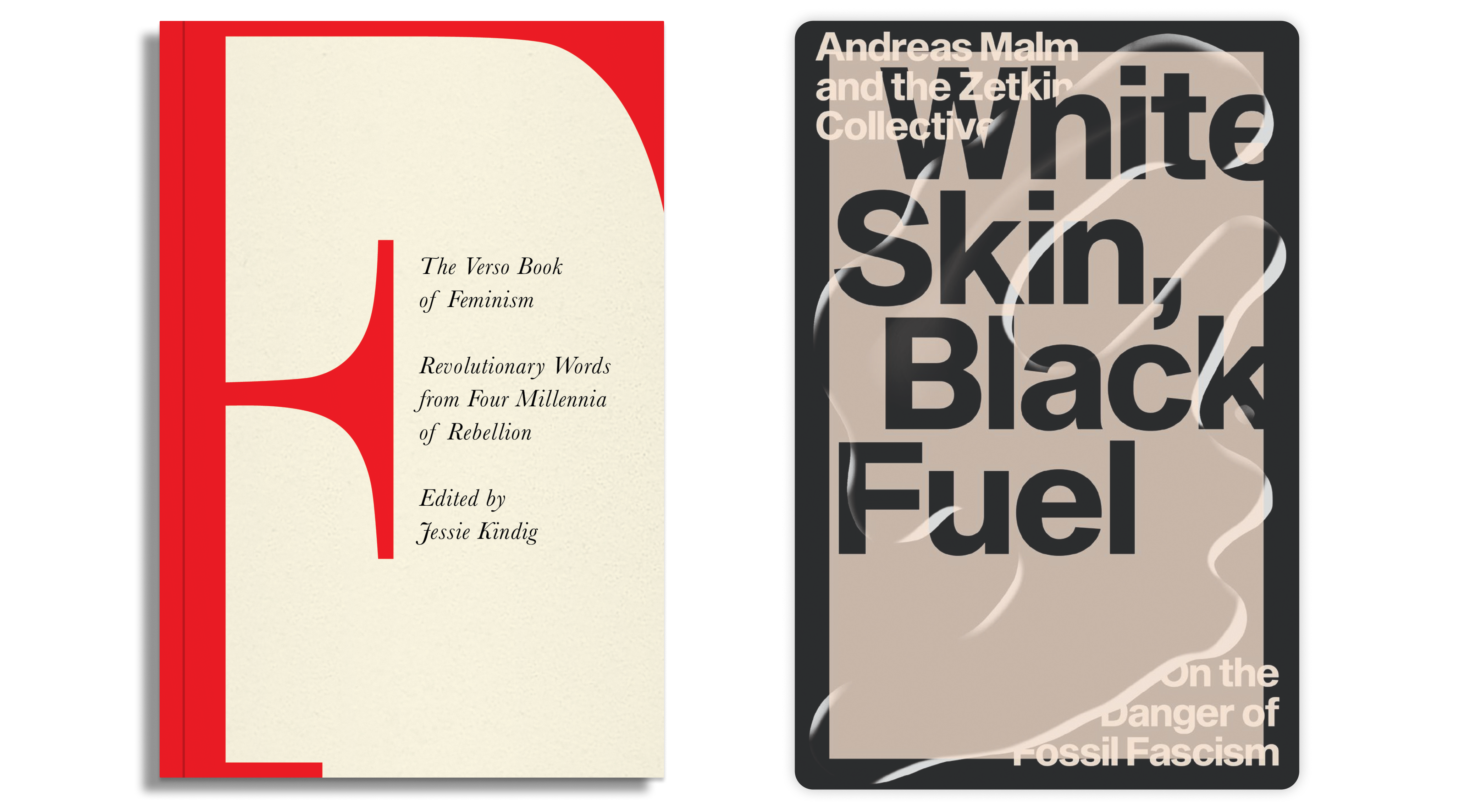
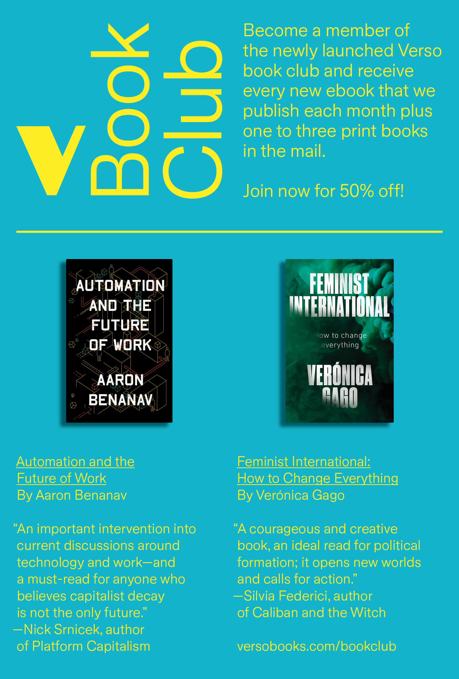
We style books in two different ways. When members receive print copies we add a drop shadow, some subtle gradients to the cover artwork and a crease on the left hand side. This visually indicates to VBC members that they will be receiving hard copies of that title. For ebooks we add subtle rounded corners to the cover and a drop shadow, indicating they are digital files. These can be quickly and easily created in Figma with our template.
Figma Template
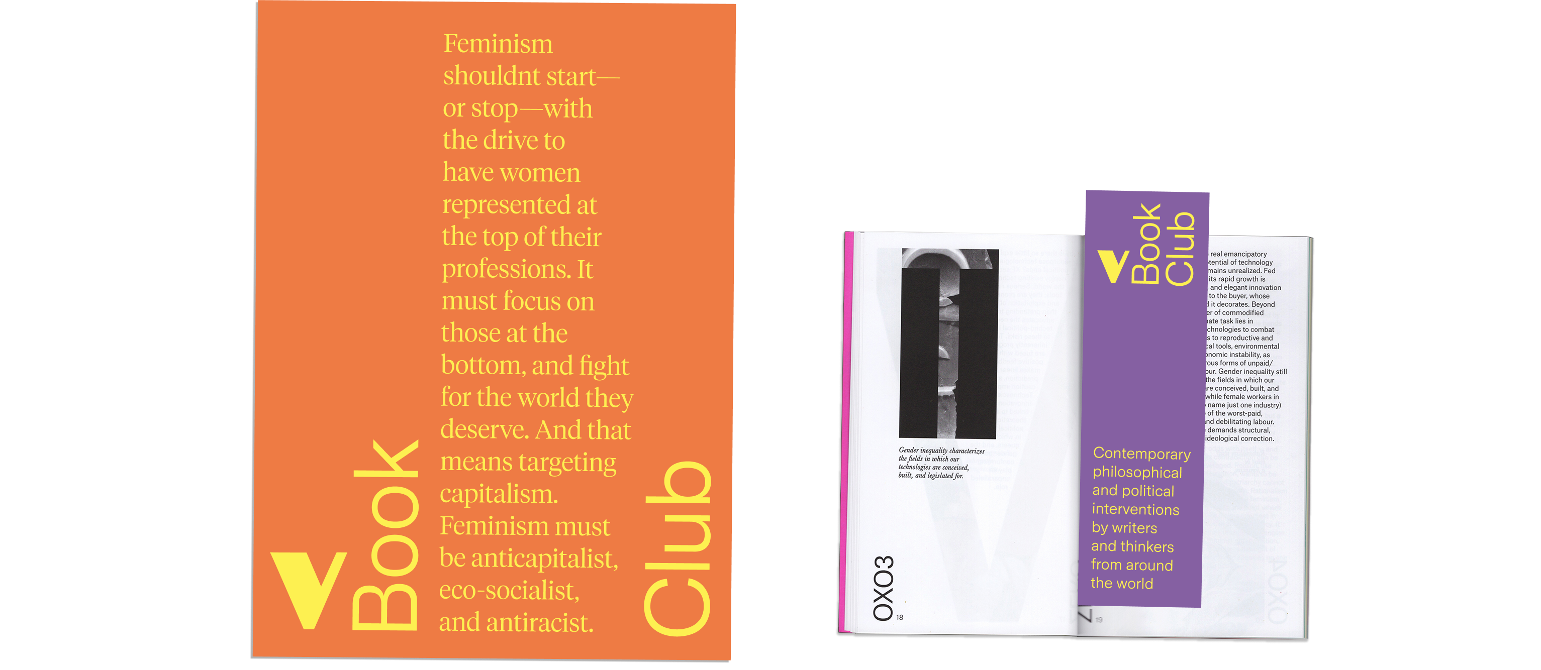
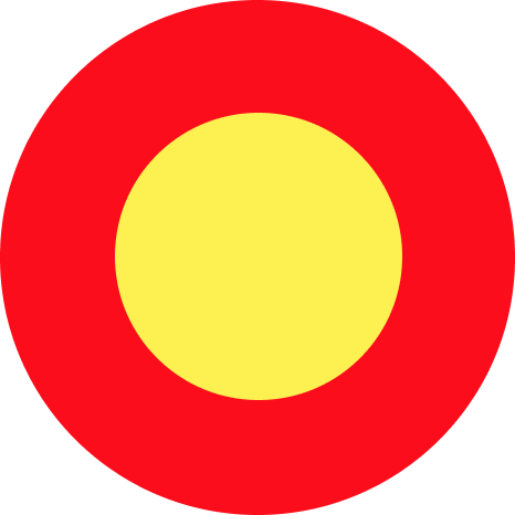
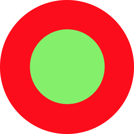
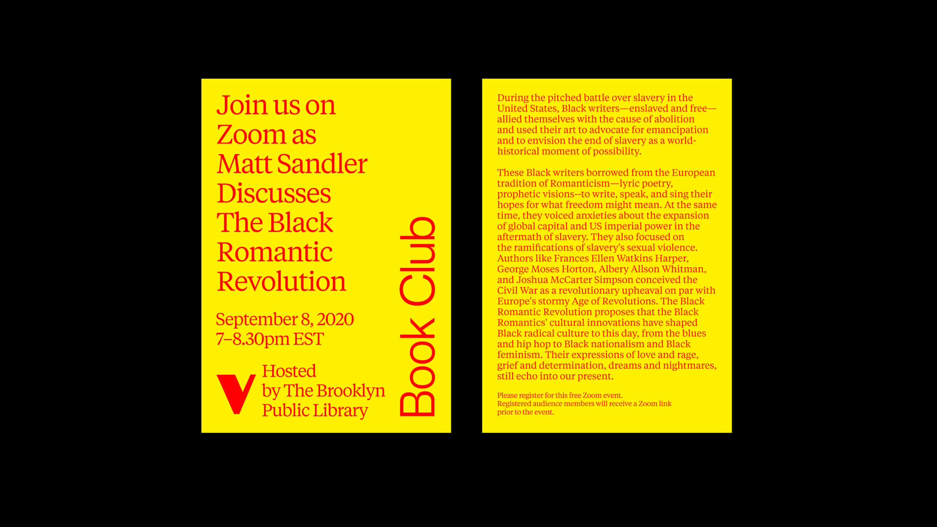
A main pillar of our visual identity is color. We typically use color backgrounds with contrasting color type.

Web: #EB3223
Print: Pantone Red 032c
C00 M00 Y00 K00

Web: #FDF051
Print: Pantone Yellow
C00 M00 Y00 K00

Web: #8560A2
Print: Pantone 266
C00 M00 Y00 K00

#FFBBD2

#DC9275

#F8F5EB

#1B4238

#131313
Clashing color combinations are utilized throughout our design application. Below are a selection of approved combos. When making your decision consider legibility, taking care to make sure there is enough contrast between background and type.


The below examples show our system in use. This section also includes links to working files which you can use, modify and expand on in the future.
Our custom email designs have a specific asset creation workflow. In our Figma doc you will find artboards and covers preapred which can be easily updated for each month. We also have production files for header images, videos, etc.
Figma Template
Download
Our custom Instagram designs have a specific asset creation workflow. In our Figma doc you will find artboards preapred which can be easily updated for each month.
Figma Template
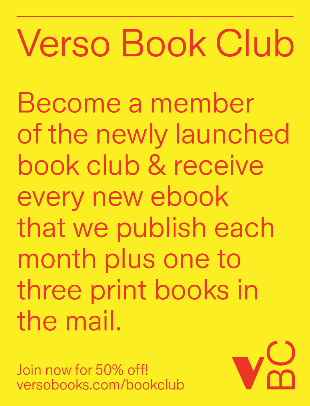
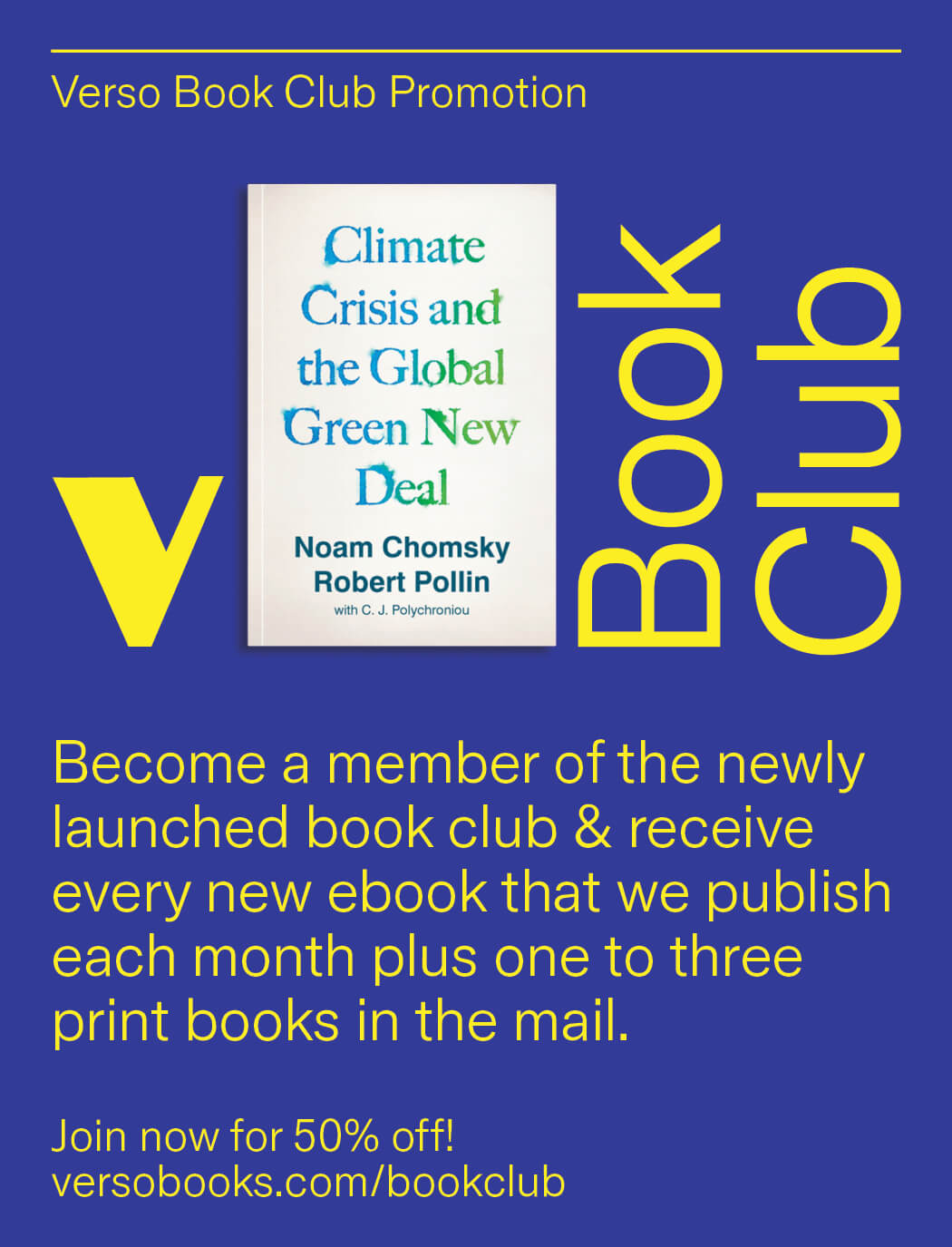
We have various print ads and color combinations prepared.
Download
Our custom Twitter design has a specific asset creation workflow. In our Figma doc you will find artboards preapred which can be easily updated for each month. Update the slide design and when finished, place in our photoshop file.
Figma Template
Download